Following the recent Twitter web UI redesign across all its platforms (new twitter GUI PSD resource we created available to download for free) I thought it a good time to look back and reflect on the still annoying interface niggles & inconsistencies that inhibit an ideal user experience across the board by providing a twitter iOS app and web UI review. As brilliant as twitter is, I hope to highlight how it could be made better and would hope to see some of these features being released over the course of the next few years.
I (as I imagine most users do) use a collection of interfaces to access twitter throughout the day and week. At work I use the web UI, on the go I use mobile app, and at home I use the iPad app. Sometimes TweetDeck (for Chrome). Sometimes Buffer.
Native UI vs 3rd party
I always used to use 3rd party apps (mostly Tweetdeck) to access twitter but found myself of late gravitating more towards the web interface as it has gradually improved. For such a long time it was the service rather than the interface that was the appeal, allowing the 3rd party clients market to thrive. I believe the tables are starting to turn now twitter is both stable and improving its experience all the time. I also found as my twitter activity grew I found the multi column approach with dynamically updating feed that Tweetdeck offers too much to take in. I started preferring a timed stints approach of allowing myself access for short periods of time during the day. I liked the idea of picking up where I left off and slowly realised it’s not the end of the world if some tweets slipped by unread.
Although I may reflect upon features of some 3rd party apps as nice additions, I’ll focus mainly on the native twitter UI’s for this analysis. Follows a critique identifying everything that annoys me day-to-day using twitter across it’s variety of interfaces.
How twitter could be further improved
Account switching
The mobile apps have account switching, within a few taps via your account page you can switch to any number of multiple accounts you run. This could be further improved by allowing easy account switching directly from the main timeline by tapping on the Twitter icon in the reader bar.
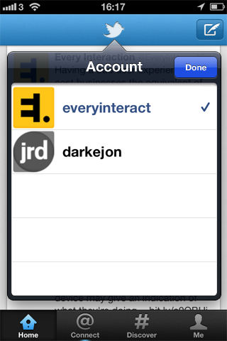
The existing quick profile switching while composing a tweet (accessed by tapping the account name in the header to access a list) is especially useful. Admittedly it’s harder to log out of and back into a mobile app than a webpage, but why don’t we have this feature included in the web UI? Other 3rd party apps manage multiple accounts better, but thats what many are specifically designed to do. Makes perfect sense for the twitter web UI to add fast account switching (much like the updated google account bar), or perhaps some way of blending multiple feeds into a single experience.
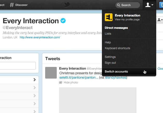
The simplest solution I can think of would be to add a ‘Switch account’ link in the existing account menu, launching a small overlay or side-menu allowing account selection.
Who follows who?
There is currently an inconsistent solution to identifying if a user follows you or not. The mobile interfaces do nothing to indicate this, however the web UI does. It a useful feature that should be carried over to all interfaces.

Search
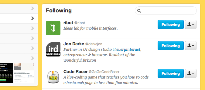
Twitter search is not great and has always been something other tools are superior at performing. With the recent UI updates it has improved significantly. But what I can’t do is search my own data. I want to be able to keyword search my own tweets, as well as search those I follow and those who follow me. As so many people use handles that are not their name, when trying to mention someone it’s often difficult to remember what they’re called. A simple search field in the followers list would remedy this issue, ideally with results generated/filtered below as you typed.
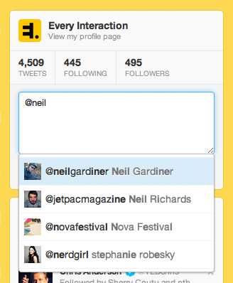
Also the whizzy @ list that allows quick user selection as you compose does not behave with much consistency. Sometimes it is able to find user I do follow (and remember their handles), other times it completely fails to do so?
While we’re on the subject of finding those who I follow/follow me, in the web UI this is presented as scroll-loading page. 20 users per load. Because of this I have at times exhausted my access allowance on twitter trying to load everyone by scrolling down, loading this page over 20 times in order to generate the complete list. This is just crazy. Load everyone at once or present normal pagination with a ‘show all’ link.
Other UI additions
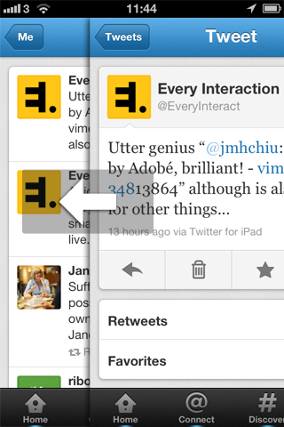
Other things I could see being useful additions to the mobile app might be better thumb control for the phone app. One-handed browsing is common, so a ‘back/side swipe’ rather than top left button to return to previous screen would be a useful addition.
Mac desktop app
The twitter desktop app is far too basic, does little well, and is frustrating to use. I won’t dwell as this topic could turn into a post unto itself, and it’d take a lot of work devise a suitable replacement concept. Another time…
What twitter does well now
Can’t end this post without pointing out how great twitter really is and how far it has come in the past year. So below are a couple of really amazing interface additions for carrying UI’s that are very welcome additions.
Search
As I mentioned before search has improved a lot. Separating the people and tweets search although might seems confusing at first makes a lot of sense as the results they produce are very different. The way the default search changes for both the ‘Connect’ and ‘Discover’ areas works as once you’re in the results area you can quickly switch form one set of results to the other. This does away for the need to have a separate ‘Search’ section as previously found on the mobile interfaces.

Tweet stream
Greatly improved for the mobile app. The mobile app design has always loaded only the recent tweets, leaving a /torn effect/ gap representing the time gap between the last load and the new tweets. Tweets that fell into that gap were forever missed, but now there’s the option to load more tweets in timed stints to fill those gaps, meaning should you desire you never need miss a single tweet.

Overall twitter UI design
Since the update the overall design of both the mobile app and the web UI have improved (although we’re still waiting for a similar update to follow for the iPad app design). It does take a little getting used to and I still struggle to find the post field on the rare occasions I submit a post through the web UI. But overall I think the team at twitter have done amazingly well, and we hope to see them continue to develop the UI and features set (to possibly include some suggestions above?) and grow the service into an ever more useful and wonderful social network.
Download the Twitter GUI PSD for free
What are your favourite UI features and gripes with Twitter? Keen to hear everyones thoughts and ideas for future improvements.
The post New Twitter iOS app & web UI review appeared first on Every Interaction.